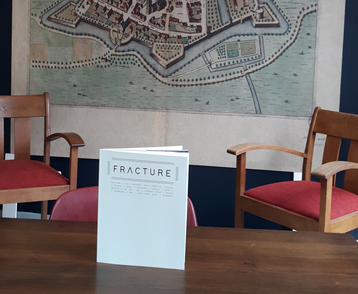
Review: Fracture

Review: F R A C T U R E ( * * * * . )
- “Nice, chaotic”, “what is this?”
- https://www.fracturemag.co.uk/ £12.00
- Fracture is a magazine unlike any others, filled was articles about politics, culture, travel, food and more.
Contents
When Byzantine Ambassador (@byzantinepower on Twitter) announced that he was going to publish a magazine I was curious, so I ordered it as soon as it became available. Now I know the answer to questions such as: Why does Portugal exist? Why do people claim the wine of the ancient Greeks tasted so good?
The author (I assume that @byzantinepower is the sole author?) answers these questions in an accessible manner with pleasant enthusiasm. But why these questions and nothing about ’the origins of Sranan Tongo’ or ’the benefits of electric tooth brushers’? I don’t know, but the result is a delightful bouquet of chaotic snippets of knowledge about the origins or future direction of surprising things.
Utter chaos or pleasant surprises? When I asked my daughters for their first impression they responded with: “nice, chaotic” and “what is this?” The challenge for an idiosyncratic magazine like this is that it will sooner or later strand in confusing chaos. However, between the lines I noticed that the author/publisher has a clear agenda. He wants to combat forgetfulness of the origins and destinations of things. For those who share this perspective the magazine will be a feast.
Production
The magazine is printed on good, non-glossy paper. (People often assume that glossy paper is more chique, but actually, the matt paper almost always looks much better.) I would likely prefer paper which is a bit thinner, because the paper used is quite stiff. This means that the magazine does not stay open when you put it down (unless you use a lot of force to crack the spine.) This brings me to one other issue, which I consider to be the only real problem with the magazine. The margins.
Simply put: 1 cm is not enough for a margin! Narrow margins mean that you are always covering text with your fingers as you hold the magazine open (which you have to do because of the stiffness of the paper.) The page numbers almost drop of the page. On top of that, in the current layout there is an odd disjunction between form and content, which I find rather distracting. Ideas worth exploring deserve and require a well proportioned page layout. If fixing the margins means fewer characters per page, leading to more pages and a higher price, I would be more than happy to pay a bit more for the magazine. (And did I mention that I really prefer a nice serif font for body text? thank you!)
Conclusion: I like Fracture and I think you should check it out.
